Posters + Branding kit
Winter Youth Jazz Festival
Description: Step into the lively atmosphere of the Winter Youth Jazz Festival in Buffalo through a project that seamlessly blends artistry and functionality. Explore a set of three versatile hand-drawn posters, designed to stand alone or come together to create a captivating visual pattern. Beyond the posters, a comprehensive brand identity was crafted, extending from tickets to social media posts. Simple yet dynamic, this project celebrates the joy and creativity of youth, embracing the soulful notes of winter across various festival elements.
Goal: To create a vibrant and cohesive visual identity for the Winter Youth Jazz Festival, capturing the energy of the event and bringing warmth to the winter season. The design needed to work across posters, tickets, and social media, ensuring the festival's message reached its audience with flexibility and impact.
Client: The Winter Youth Jazz Festival in Buffalo, a community-driven event celebrating young talent and the rich tradition of jazz.
Final Deliverables
11 x 17 Series of Posters
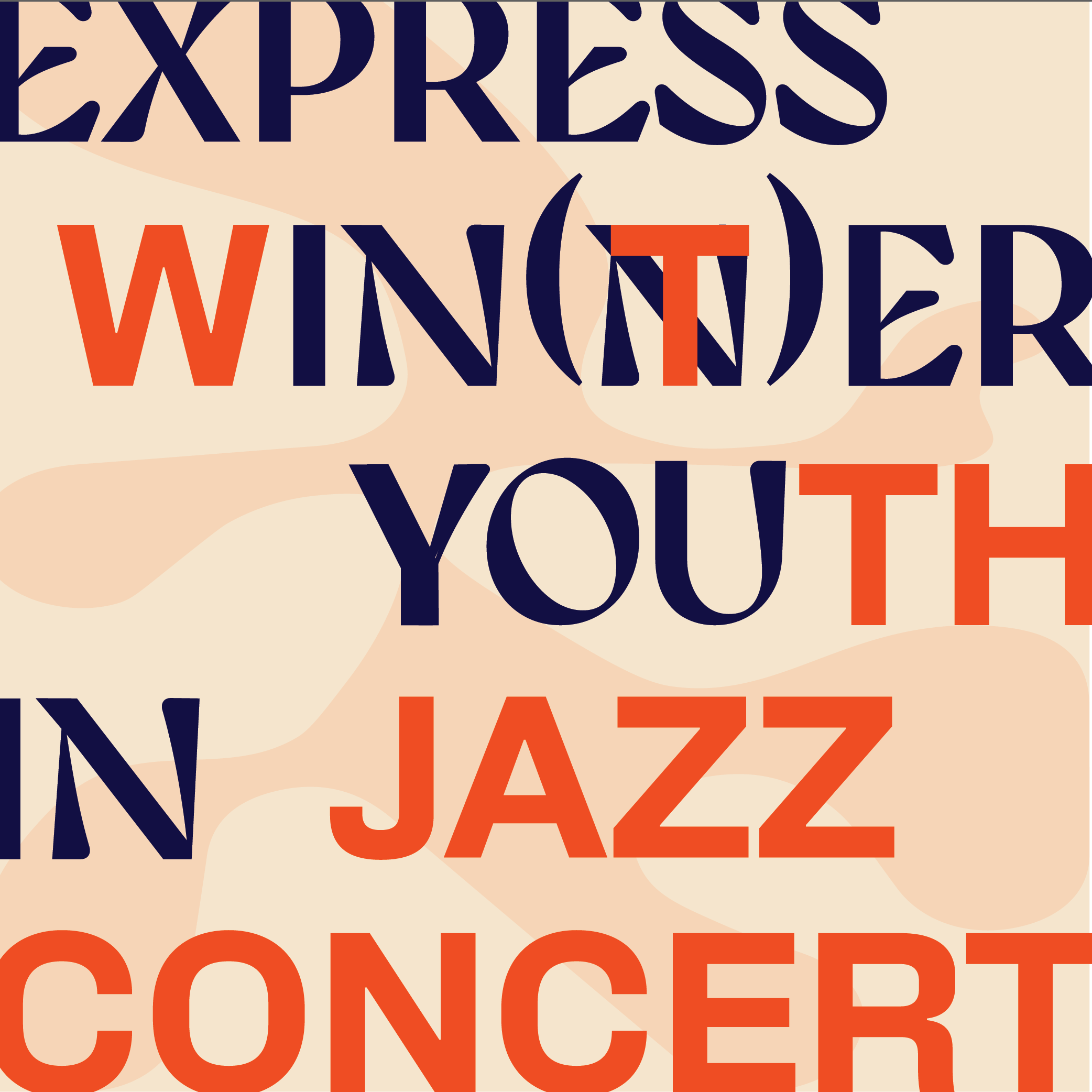
Final deliverables for the Winter Youth Jazz Festival project include a series of three hand-drawn posters, designed to be displayed either individually or as a cohesive set. Recognizing the limited availability of spaces in the city to display all three posters together in sequence, I ensured that each poster could effectively convey the festival’s message on its own, while still forming a unified visual pattern when placed side by side.
Though jazz is often associated with blue tones, studies show that the music evokes a sense of warmth. This insight inspired the choice of a vibrant color palette, which injects energy into the festival’s branding and counters the winter chill, aligning with the lively, youthful spirit of the event.
Branding Kit
Entry Ticket
Character Design
The branding kit for the Winter Youth Jazz Festival in Buffalo provides a unified visual identity that extends across all touchpoints of the event. It includes a dynamic logo, a versatile color palette, and custom typography that reflect the energy and warmth of the festival. From event tickets to social media graphics, every element was designed to reinforce the festival's lively, youthful vibe. The kit ensures consistency across physical and digital platforms, with clear guidelines for logo placement, font usage, and color application, making it easy for the brand to remain cohesive in any context.
Shopping Bag
Express inner you.
Concert slogan
Character Design
Color Palette
Banner Design
Instagram Page Posts Design
Process
Research and Initial sketches
This project was challenging from the start, since there is a lot of pre-formed opinions about how jazz should be portrayed and what you can and cannot do when it comes to design anything for it. However, I was able to do a research that showed how people actually feel about jazz music, that in the most cases it feels warm to them and brings happiness and calmness to their lives.
Based on this, I decided to choose a color palette that will both be warm and calm, and will stand out in any space it will be put into. Everything in this project is hand-drawn, from characters to typography, in order to show how intricate jazz is.
Results and Impact
The Winter Youth Jazz Festival branding achieved its goal of connecting the warmth of jazz with the season’s cold, creating a memorable identity that resonated with both young audiences and festival organizers. Feedback highlighted the cohesive yet flexible poster designs, which work individually or as part of a larger display. The social media templates and tickets added continuity across all festival touchpoints, enhancing audience engagement. This project underscored the importance of balancing creativity with practicality, showcasing a visual language that is both distinctive and adaptable.


